VGHVI Minecraft: March 31, 2016
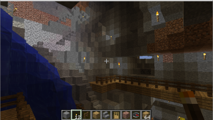
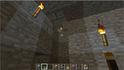
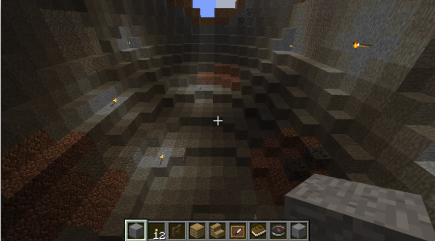
For the March Minecraft session I wanted to think about how the long balcony I’d added in February affected the cave I was working on. So at first I wandered around a bit:
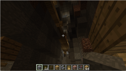
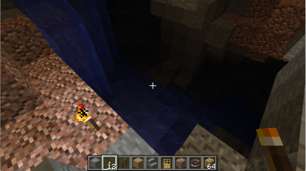
I have no idea where this is from; probably not even that same cave, maybe it’s the ravine in the ice forest?
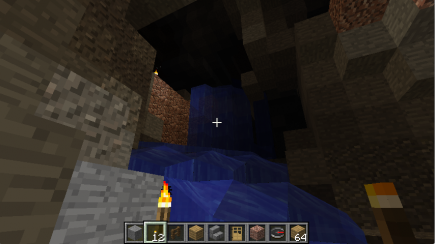
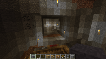
I remember looking in the glitch cave, and deciding that it didn’t actually go all the way through to the outside. Which is a potential area for further change: maybe I could dig out from there and turn it into a third entrance to the cave? I’ll think about that this week.
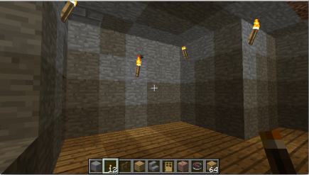
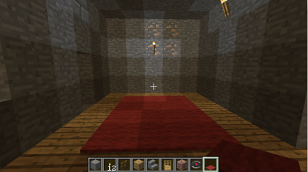
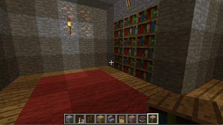
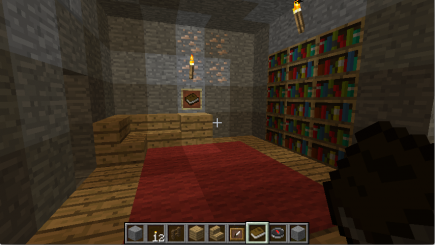
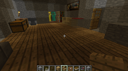
At any rate, the main area that I settled on was the lower room in the back: it’s too shallow. So I deepened and furnished it, so it could start to stand on its own.
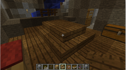
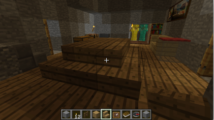
Once I had that looking nice, I got to thinking about the first large room I’d finished: I liked its sides, but there’s too much space in the middle. So I decided to build a table there:
My memory when building that was that I thought it might be too big and/or not a great design. When I look at it in those pictures, though, it seems fine from a space point of view, but clearly the wrong color: I don’t want the table to blend into the floor! So I’ll change that this month.
I don’t have a good picture representing all of this, but my current hypothesis is that it’s starting to point me at a coherent aesthetic that wasn’t there four months ago: the band of wood from the balcony combined with using that wood as the floor for finished rooms is a nice counterpart to the stone walls elsewhere. So I want to see if I can continue that pattern while finishing off other areas.
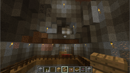
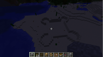
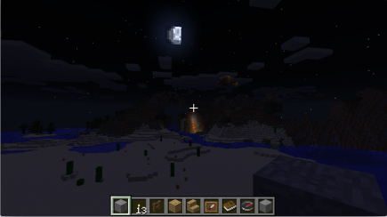
After doing that, I did my usual flying around:
